
Having data about your clients and the performance of your teams is important for any business. However, data by itself doesn't create insights or paint a clear picture of successes or new opportunities.
It's vitally important for sales, marketing, and customer success teams to shape data into clear (and concise) stories for all stakeholders.
One way to do this is to create data dashboards. This post provides practical tips for designing impactful dashboards in HubSpot.
Know why you’re creating your dashboard.
When it comes to building a data dashboard, ask yourself, “what problem does this board need to solve?” Forcing a dashboard when one isn’t needed is a great way to waste time and resources.
Understand the purpose behind your board and your goals, and then what necessary metrics you need to identify, measure, and improve.
To start, focus on five to ten most important metrics and report on those per dashboard.
If you do, you’ll have a clear understanding of when you’re adding value to the problem and when you’re not and will help tell the true story to stakeholders.
Not all stakeholders are created equal and are often looking for different metrics depending on their department. Defining your target onlookers will help you:
- Ensure you’re creating the right board, for the right people.
- Better understand how to communicate and act on the right data.
- Increase the likelihood the dashboard will be well-received.
Start by asking yourself a few questions:
What problems does this board need to solve?
Most teams have some understanding of why they exist. Your data dashboard should be related to that purpose and align with the target group’s overall objectives.
What metrics are most important to the target group?
Choosing the right metrics depends on many factors like the type of offering or product, business model (B2C/B2B), industry (e-commerce/SaaS), job function (product/marketing/sales), and more.
What does the group stand to gain from this dashboard?
Great metrics lead to insights — which lead to actions and results. Write down what clarity observers will walk away with after looking at the board.
Once you answer the questions above, you’ll have a better idea of who’s looking at your dashboard and can determine how in-depth you need to go with tracking.
Designing Your Dashboard

Place your most important metrics in the top, left-hand corner. Structuring content to read from left to right is one of the best ways to improve comprehension.
If your viewer skips something or gets distracted, you want them to remember the essential details. You don’t want them to miss out on the good stuff because it lives in the wrong place.
Group data together.
Group-specific data in dashboard components. There is nothing worse than going to a data dashboard and the information is all over the place. When you’re creating your data dashboard, focus on specific topics and groups. Grouping content together in a clear way is important to give a complete overview of data. Plus, it helps viewers access the right information, at the right time.
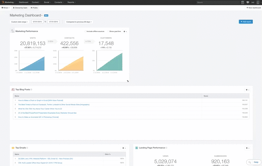
Give your numbers context. To know if a number’s good or bad your viewers need context. Would they know, for instance, that 42 new leads today is out of the ordinary?
One of the easiest ways to do this is to include past data. You could include the same metric for the previous day, or even a line or column chart showing how the metric tracks over a longer period. Another technique is to include the average or previous highs and lows.
If you’re working towards a goal, include the target as well as your current progress. You can also add warnings for when a metric is above or below a certain threshold to make it easier to spot problems.
Use text blocks to communicate cause and effect.
Another important thing to note is that all of your business data is related and changing. One thing in your business may affect multiple data points across many of your dashboards.
One of the hardest things to do is to spot and understand how one data point or set of data points correlates to another. We also recommend adding text blocks within your data to help identify different sections and even give your notes on how the data correlates. Doing so will make it much easier for your audience to understand what the data is telling you.
Remember to set correct time frames.
It’s easy for data to lie. One of the easiest ways to have your data lie to you is to have incorrect, inaccurate, or inconsistent time frames.
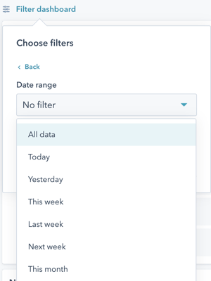
If you’re preparing several pieces of data for presentation, each piece likely needs to be set to the same time frame to avoid confusion or false assumptions.
Sometimes having different time frames is necessary. In most cases, it’s critical to clearly outline the different time frames and why they are different. The last thing that you want is the person that the data was prepared to misinterpret because they don’t realize that the time frames are not the same.
This last tip builds on the last one, but it’s important to account for how you’ll share your dashboards with a stakeholder. This can change how you structure the dashboard and what information you spell out clearly.
If you’re presenting the data in person, you can leave out some text blocks and explain the data within your presentation. However, it’s more likely you’ll be sending the dashboard to your audience and they’ll view the data on their own. If this is the case, give as much detail and explanation as possible. You don’t want your audience to misinterpret a data point in the dashboard — it could result in poor business decisions and mistakes.
Keep evolving your dashboards!
Our final piece of dashboard design advice is the most important. Once you’ve built your dashboard don’t just leave it. Ask your team for feedback.
- What do they look at most often or find most useful, and why?
- What do they never look at or find least useful, and why?
- Is there anything missing that they’d find useful?
- Has it changed anything about the way they work?
Use this feedback to iterate your dashboard. Check your dashboard is driving the behavior you intended. Step back from your board now and then and look at how all the elements work together. Remind yourself what information you’re primarily trying to get across and how effectively those important elements stand out.
As your goals and priorities change, make sure you update your board so it acts as the heartbeat for whatever you’re doing.
Need more assistance with automated reports and custom dashboards in HubSpot?
Our HubSpot & RevOps Consultants are here to help! >>
