
Mobile devices are the new preferred method of web browsing and shopping. Is your digital content ready?
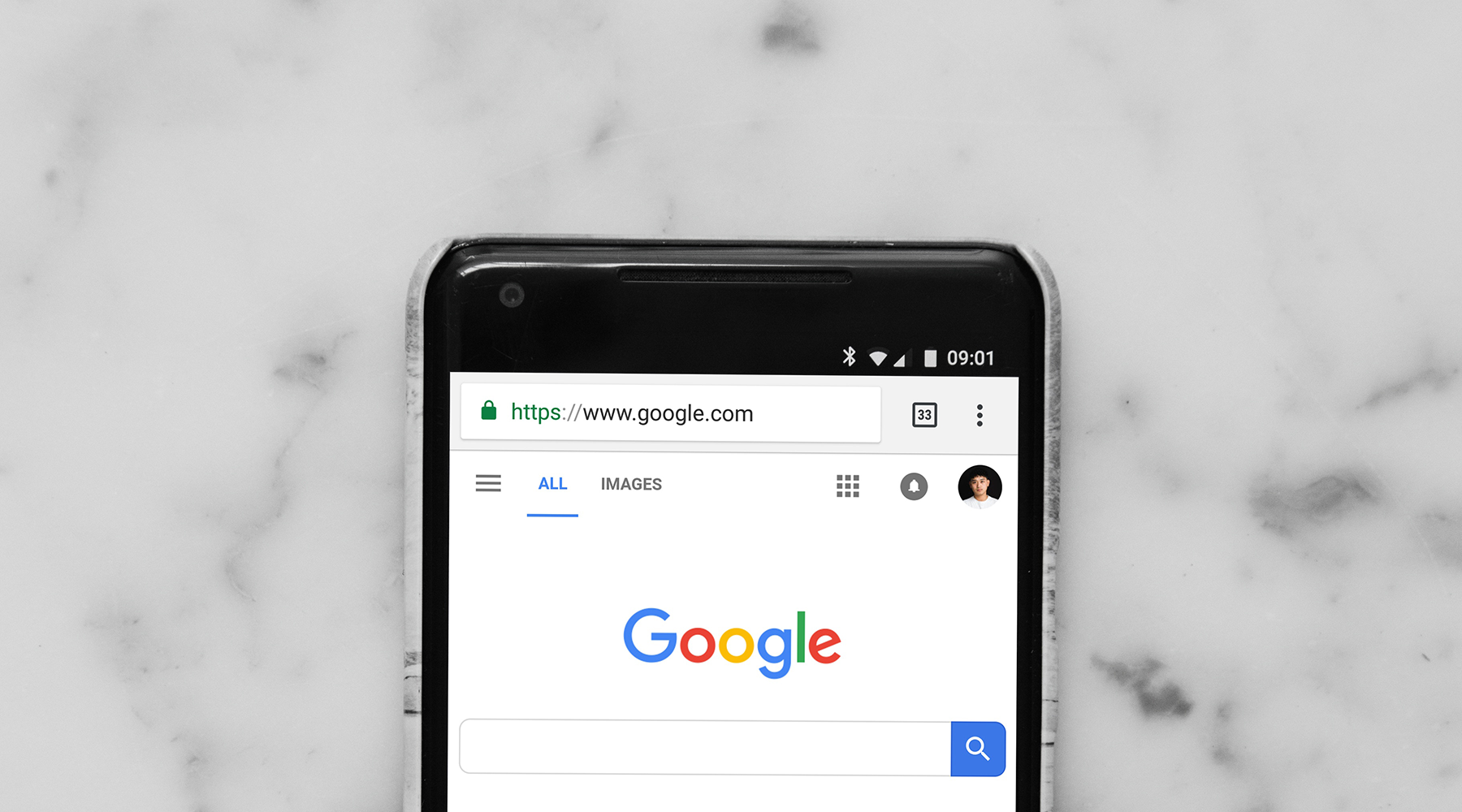
If you’re reading this, you probably own a smartphone. You might even be reading this ON your smartphone! With the power of the internet in our pockets, today’s consumer is empowered to make informed decisions on the spot, without having to step into your store or talk to a salesperson. So how can you reach into those pockets? With your not-so-secret weapon: your website.

In 2018, BrightEdge reported that nearly 60% of its clients’ web traffic came from mobile devices, and that number can be even higher in certain industry categories like Food and Beverage according to a Hitwise report. With those statistics in mind, is your digital content ready for mobile traffic?
Your website is your best salesperson — available 24/7 to your potential customers. But if it isn’t user-friendly on the device that a visitor is most likely to use, what good is it? As online browsing and commerce shift to smaller screens, it’s important for businesses in all categories to consider mobile optimization.
What is mobile optimization?
Mobile optimization is a strategy for making your website and other digital content compatible for mobile phones to provide an optimal user experience.
While mobile browsing is convenient for potential customers, there are some limitations to working within the mobile medium such as limited screen size and performance due to network lags.
So, with these hurdles in front of you, why should you bother investing time and effort into mobile optimization? The answer is simple: Optimizing for mobile should be important to your business because it is important to your customers and the search engines that serve them content.
Why is mobile optimization important to potential customers?
Visitors to your website are there for a reason — they want to see your content! But when your potential customers encounter poor layout, frustrating navigation, and images that won’t load, they are likely to bounce away from your page.
The stats speak for themselves: 43% of consumers are unlikely to return to a slow-loading mobile site, and 40% of consumers will go to a competitor’s site after a bad mobile experience on your website.
When someone visits your store, you wouldn’t make it difficult for them to get in the door or display your products on broken racks, so why would you present your business online any differently?
Your website visitors are potential customers, so you should present them with an exceptional experience, no matter the device they are using.
Why is mobile optimization important to Google?
With so many people browsing on mobile, it’s imperative for Google to prioritize the devices that most of its visitors are using.
Google’s ranking system determines what gets shown in search results, and Google has begun mobile-first indexing. This means that Google’s algorithms are primarily using the mobile version of your website to rank it for search results.
It’s in the best interest of Google and other search engines to provide their users with the best possible experience, so of course they are going to serve up results that align with those goals. If you want you want Google to serve your content to its users, you should make Google’s goals your priority. This means having a website that’s well optimized for mobile.
Mobile Optimization Best Practices
Because user experience is so important and most visitors to your site are viewing it on a mobile device, it’s in your best interest to follow mobile optimization best practices. We’ve gathered our top 10 here for you:
1. Make your website search engine friendly
This gets a bit technical, but it all comes down to this: when you help Google, Google helps you. By adding descriptive information to the backend of your website, you create additional structured data to help search engines crawl and rank your site.
Because search engines benefit from serving their users the highest quality information possible, any additional header tags, meta descriptions, or schema markups that you provide can give the search engine “bots” more of a structure to grab onto while crawling the code of your website.
Why does this matter? The more the search engine knows about your site, the more it can serve your site to users with queries that match your content.
2. Adopt a responsive website design
While you can change up your existing desktop website design to be more mobile-friendly, a responsive website is the real key to user-friendly content viewing.
Responsive site designs will automatically resize and adjust your content to accommodate the size of the screen it is being displayed on, reducing the need for excessive zooming or horizontal scrolling. This can include simplifying menus and rearranging on-page modules to better display your content without taking away from the user experience.
3. Optimize for load time
The time that it takes for your page to load on a mobile device can be a deciding factor in whether or not a visitor will stay on your page or bounce.
Ideally, your site — or, at the very least, the content above the fold — should load in 1-2 seconds. Google reports that 53% of mobile site visitors will abandon a page that takes longer than 3 seconds to load.
Not only does page loading speed matter to your users, it’s also a factor in search engine ranking. Google wants to send its users to pages where they will have a great user experience. So, if your lagging site is going to frustrate viewers, Google’s algorithms will be less likely to recommend your site to users by displaying it near the top of search engine results pages (SERPs).
You can take steps to reduce your load time by performing site optimizations like minimizing redirects, removing extraneous code and scripts, resizing and compressing content, and leveraging caching.
4. Streamline your content and navigation
On small screens, real estate is limited, so make the most of what you’ve got. Every piece of content should contribute to your message — focus on the value of your content rather than the volume. As the old adage goes, sometimes less is more.
While you are making the most of a small space, don’t forget to consider your navigation. Most mobile users can intuitively navigate using a simplified menu, but you should make it easy for them to get back to your homepage if needed. Above all, make sure that your simplified navigation is consistent across your site.
5. Make sure your text is large and legible
No matter how good your viewers’ eyesight may be, if the text on your website is small it will be downright tiny on a mobile device.
You can avoid frustrating your visitors by limiting the number of fonts on your website and using a simple, sans-serif, non-stylized font that’s at least 14 point size for your main blocks of text. If your viewers have to zoom in on your text to be able to read it, it’s too small.
The amount of text on your page also plays a part in optimization. It can be disorienting and frustrating for viewers to navigate an enormous block of text with no breaks. Keep your text blocks bite-sized and consider using bullet points to break your content into smaller chunks.
You can also try breaking up text with strategically placed whitespace, imagery, taglines, or testimonials. Your readers will thank you!

6. Optimize your images and videos
Images and videos are powerful marketing tools, but you’ll need to be careful to ensure that they enhance — not overpower — your visitors’ mobile experience. In order to optimize for load times, as mentioned above, you’ll want to size and compress your images appropriately and be selective about how many photos you use.
You should also keep user experience top of mind. An image that is too large to fit on the screen or too small to serve its purpose of showing product detail doesn’t help your potential customers. You can resolve this issue by implementing a responsive design, which will automatically resize your images to fit the viewer’s screen, and making product images expandable to show greater detail.
Video should also be used strategically. Keep in mind that most mobile browsers don’t support Flash videos, so avoid using this outdated technology. A responsive video player is also key for user experience. If your video loads at full size without adjusting for screen size, it may be too large to view and can slow page load times.
7. Design your site for touch navigation
Since your users are using their fingers, not a mouse, to navigate your site, it’s essential to make clickable elements just the right size and far enough apart. It’s annoyingly easy to accidentally click on elements if they are too large or in the path of a scrolling finger, and just as frustrating to attempt to click on tiny links that refuse to engage.
When designing your site, keep touch screen navigation in mind so that your users don’t lose theirs!
8. Simplify all forms
If your page contains forms, keep them short with as few fields as possible. If your form creates too much hassle for the visitor, they might choose to abandon your page altogether.
Additionally, you can reduce friction by removing unnecessary form fields, which can give your conversion rate a boost. Even marketing guru Neil Patel saw his conversion rates increase by 26% when just one form field was removed.
If you must collect information beyond the bare essentials you need for marketing, make it clear which fields are optional so that visitors can self-select how much information they want to share.
9. Avoid intrusive pop-ups
It’s happened to everyone — you are trying to read an article or examine a potential item for purchase when you’re interrupted by a huge pop-up advertisement blocking your view. It’s annoying, right?
Your visitors came to your page for content, not ads. When used in the right way, pop-ups can provide helpful information or deals that visitors might be interested in. However, these are best implemented when they don’t block users from viewing your site or interrupt an otherwise pleasant user experience.
Not only are pop-ups annoying to your visitors, but as of January 2017, Google also penalizes intrusive website pop-ups with a decreased ranking. It’s in Google’s best interest to provide its users with an optimized browsing experience, so if you’re still using full-screen pop-ups, Google is less likely to send its users to your site.
Certain pop-ups are still admissible if they are required by law, such as age verification or GDPR compliance cookie opt-ins, but if you absolutely must have a pop-up ad or prompt for newsletter sign-up, make sure that it is small enough that it doesn’t detract from the content on the page.
10. Add a click to call option
In the digital marketplace, potential customers are likely to research your business online before visiting your store or reaching out to you, but that doesn’t mean that they don’t want to get in touch with you. Make it easy for them to reach you by including a click-to-call link or button in your contact information.
No one using their smartphone is likely to write down or remember your number long enough to manually type it into their touchpad. By making this a one-click process, you reduce friction and increase the likelihood that potential customers will commit to purchase.
Don’t forget about email
While your emails aren’t going to affect your search engine rankings, you should still consider your audience when creating email content. According to Adestra, in 2017 global trends showed that mobile was the preferred method for opening emails, hovering around 60% of all opens compared to desktop and webmail.

Image sourced from Adestra
Many website optimization principles can be applied to emails as well. Keep the mobile experience in mind at all times — simplify your designs, pare down your text, and create clear and clickable calls to action.
It’s all about the viewer
While you might want to cram your website full of awesome info about your product or service, you have to think about what device your viewer is using and how that device will affect their experience visiting your site. By optimizing for mobile, you are actually optimizing for business overall.